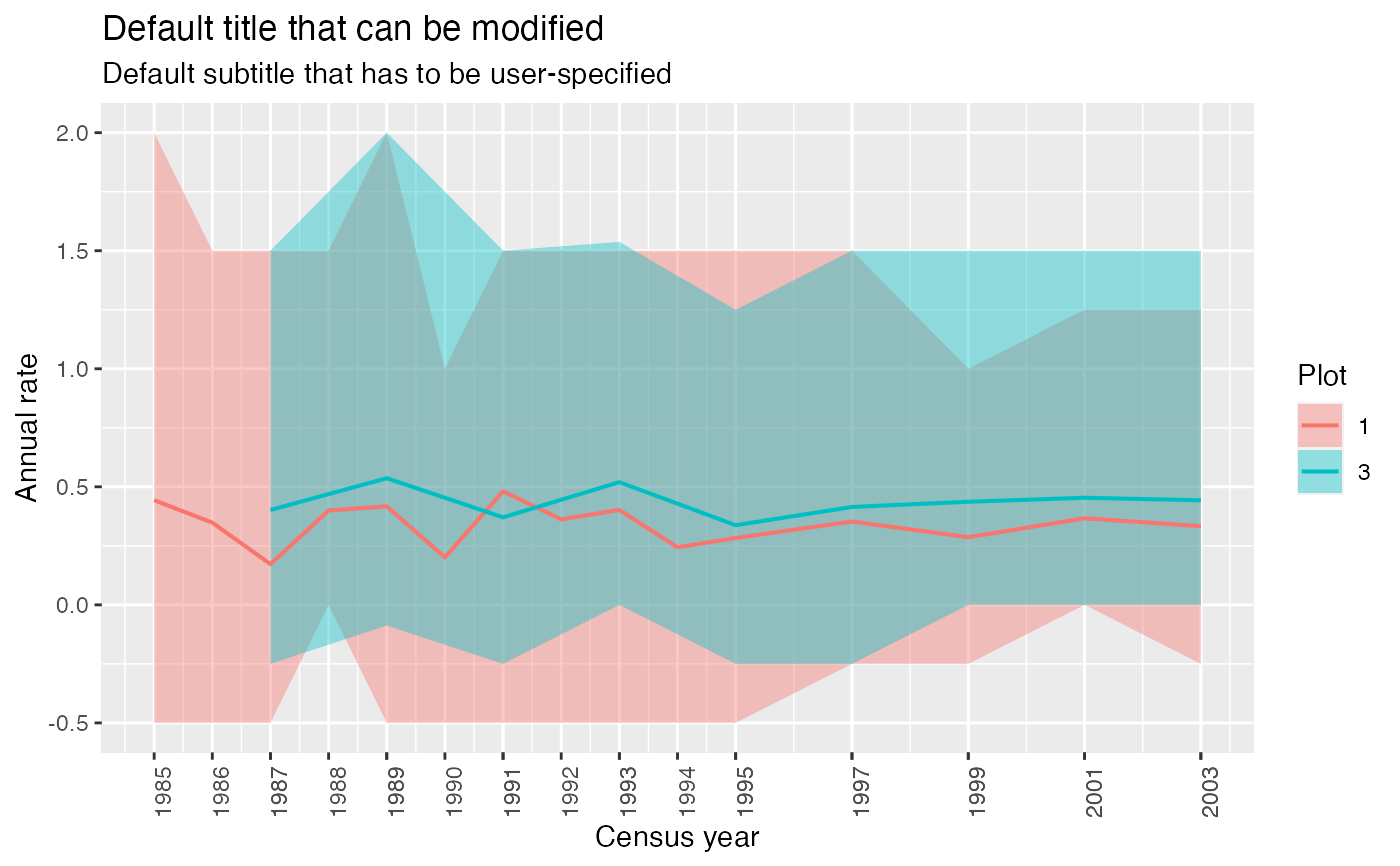
Display annual growth rates using ggplot2
display_growth.RdDisplay annual growth rates using ggplot2
display_growth(
  growth,
  type = "ribbon",
  time_col = "time",
  color_col = "Plot",
  growth_variable = "mean",
  faceting = FALSE,
  title = "Annual growth in function of census intervals.",
  subtitle = NULL,
  save_graph = FALSE,
  device = "png",
  path_save = file.path("ForestGraphs", paste0("annual_mortality_recruitment_", type,
    ".png")),
  name = "annual_growth.png",
  create_folder = FALSE,
  overwrite = FALSE,
  ordered_percentiles = c("P5", "P95"),
  ...
)
Arguments
| growth | A data.frame outputed from compute_growth |
|---|---|
| type | Character, the type of graph (recommended: "line" or "ribbon") |
| time_col | Character, name of the column corresponding to census time |
| color_col | Character, name of the colomn used to define lines' colors, defaults to "Plot". |
| growth_variable | Character |
| faceting | Character, name of the variable used for faceting -see after- but defaults to FALSE i.e. no faceting. NB: faceting refers to using a grouping variable to layout multiple plots, each corresponding to a category of the grouping variable. See details for a pratical explanation. The scales are free on the x axis: t correspond to several groups not necessarily having the same censusing temporal resolution; but are bound on the y-axis: the values are displayed on the same scale for comparison purposes. |
| title | Character,title of the graph. |
| subtitle | Character, subtitle of the graph. Defaults to |
| save_graph | Logical, indicates whether the graph must be saved or not.
Defaults to |
| device | Relevant if |
| path_save | Relevant if |
| name | Relevant if |
| create_folder | Relevant if |
| overwrite | Relevant if |
| ordered_percentiles | Numeric, if plotting a ribbon, please indicate the percentiles used when aggregating the data. |
| ... | Additional arguments. Notably, verbose = F turns most warnings off |
Value
A ggplot graph
Examples
data(example_size_corr) growth <- suppressWarnings(compute_growth(example_size_corr, size_col = "size_corr", measure_type = "cir", status_col = "CodeAlive", id_col= "idTree", time_col = "CensusYear", what_output = "annual", aggregate = TRUE, by = c("Plot"), stat = "mean", percentiles = c(5,95)))#>display_growth(growth)#> $mapping #> Aesthetic mapping: #> * `ymin` -> `P95` #> * `ymax` -> `P5` #> * `fill` -> `Plot` #> * `x` -> `time` #> #> $alpha #> [1] 0.4 #>
